Here are some specific activities, investigations or visual aids we have picked out. Click anywhere in the grey area to access the resource.
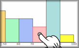 Histograms Practise drawing and reading information from histograms displaying grouped data
 Reading Graphs and Charts Answer real-life problems from different types of graphs and charts including piece-wise linear graphs.
 The Beauty of Data Visualization Complex data sets (like military spending, media buzz, Facebook updates) are turned into beautiful, simple diagrams.
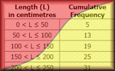 Cumulative Frequency Online exercises on cumulative frequency for discrete and grouped data with exam-style questions.
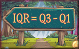 Quartiles Practise processing the sets of numbers to find the lower and upper quartiles.
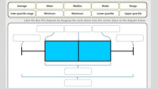 Box Plots Video Box plots, sometimes called box and whisker diagrams, are a useful way of visualising data.
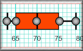 Box Plots An exercise on reading and drawing box-and-whisker diagrams which represent statistical data.
Here are some exam-style questions on this statement:
- "The grouped frequency table gives information about the times, in minutes, that 90 commuters take to get home from work." ... more
- "Kevin recorded the heights, in centimetres, of some cows." ... more
- "155 people were asked how much money they would pay for particular three-course meal in a special restaurant." ... more
- "The distance walked by each of 68 hikers was recorded. The results are shown in the cumulative frequency curve." ... more
- "The scatter graph gives information about the marks earned in a Statistic exam and a Mathematics exam by each of 13 students." ... more
- "Here is some information about the length of time children spent in a swimming pool at a holiday resort during a heat wave." ... more
- "The table shows the marks earned by 200 students taking a Maths exam." ... more
- "The table shows the amount of time, in months, taken to sell houses on the Happyland housing estate." ... more
- "This histogram shows information about the ages of 317 people attending a charity concert. The cost of tickets for children under 15 years of age are half price. If a full price ticket was £18, estimate the total income of all 317 ticket sales." ... more
- "The distribution of daily average wind speed on an island over a period of 120 days is displayed on this box-and-whisker diagram." ... more
- "The following grouped frequency table shows the length of time, \(t\), in minutes, visitors watched an octopus swimming around a tank at an aquarium." ... more
- "Derek has put together a fantasy football squad and has recorded the heights of all the players in the squad rounded to the nearest centimetre. The data is illustrated in the following box and whisker diagram." ... more
- "The charts below show the results of pupils in a Year Group answering twenty mental arithmetic questions." ... more
- "Poppy Pringle recorded the heights in centimetres of the sunflowers growing in her brother's and sister's gardens." ... more
- "The histogram gives information about the distribution of the heights of some shrubs grown by a garden supplier." ... more
- "The following table shows the number of days families spend in a particular seaside hotel in August last year." ... more
- "Data is collected about size in square metres of apartments in a city and the monthly cost of renting them. The size of the apartments is shown in this box and whisker diagram." ... more
- "A TV company surveyed 88 of its employees to find out how much time they spend travelling to work on a given day. The results of the survey are shown in the following cumulative frequency diagram." ... more
- "This cumulative frequency graph shows the speeds in kmh-1 of cyclists passing a certain point on a race track." ... more
- "Gringe Hull Secondary School has students from Year 7 to Year 13. A group of 138 students in Year 9 were randomly selected and surveyed to find out how long it takes them to travel to school each morning. Their results are represented by the following cumulative frequency graph." ... more
- "A number of organically-grown carrots were measured (in centimetres) and the results recorded. The following box and whisker diagram shows a summary of the results where L and U are the lower and upper quartiles respectively. The diagram is not drawn to scale." ... more
Click on a topic below for suggested lesson Starters, resources and activities from Transum.
Furthermore
Cumulative frequency graphs are graphical representations that display the cumulative frequencies of a dataset. They are particularly useful for determining various statistical measures such as the median, quartiles, percentiles, range, and interquartile range (IQR). The median is the value that separates the higher half from the lower half of a dataset. Quartiles divide a rank-ordered dataset into four equal parts. The IQR is the range between the first quartile (Q1) and the third quartile (Q3) and represents the middle 50% of the data. Percentiles, on the other hand, divide the dataset into 100 equal parts.
Box and whisker diagrams, also known as box plots, are another tool used for data analysis. They provide a visual representation of the distribution of a dataset. These diagrams are especially useful for comparing two distributions in terms of symmetry, median, interquartile range, and overall range. The symmetry of the box and whiskers can give insights into whether the data may be normally distributed. A symmetric box plot suggests that the data is likely to be normally distributed, whereas an asymmetric one indicates otherwise.
Key formulae:
$$ \text{Median} = \frac{n + 1}{2} \text{th term} \\ \text{Q1} = \frac{n + 1}{4} \text{th term} \\ \text{Q3} = \frac{3(n + 1)}{4} \text{th term} \\ \text{IQR} = Q3 - Q1 \\ \text{Range} = \text{Maximum value} - \text{Minimum value} $$Example:
Consider a dataset: \( \{3, 7, 8, 5, 12, 14, 21, 13, 18\} \).
Arranging in ascending order: \( \{3, 5, 7, 8, 12, 13, 14, 18, 21\} \).
Using the formulae:
Thus, for this dataset, the median is 12, Q1 is 6, Q3 is 16, IQR is 10, and the range is 18.
If you use a TI-Nspire GDC there are instructions useful for drawing box plots.
There are actually four different methods for calculating the quartiles of a data set. These are explained on the Wikipedia page on quartiles. For discrete data, it turns out that there is no universal agreement on how to determine quartile values.
For example, consider the ordered data set: 6, 7, 15, 36, 39, 40, 41, 42, 43, 47, 49.
Here are the lower quartiles calculated using four different methods:
| Method | Lower Quartile |
|---|---|
| Method 1 | 15 |
| Method 2 | 25.5 |
| Method 3 | 20.25 |
| Method 4 | 15 |
This variation in results highlights the nuances in statistical definitions that we often overlook. It's fascinating (and humbling) to realise that even concepts we thought were straightforward can be approached in multiple ways, depending on the methodology used.
This Bicen Maths video clip shows everything you need to memorise on Representation of Data for A Level Maths.
How do you teach this topic? Do you have any tips or suggestions for other teachers? It is always useful to receive feedback and helps make these free resources even more useful for Maths teachers anywhere in the world. Click here to enter your comments.