
|
|
Exam-Style Questions.Problems adapted from questions set for previous Mathematics exams. |
1. | GCSE Higher [519] |
The grouped frequency table gives information about the times, in minutes, that 90 commuters take to get home from work.
| Time (t minutes) | Frequency |
|---|---|
| \(0 \lt t \le 10\) | 6 |
| \(10 \lt t \le 20\) | 32 |
| \(20 \lt t \le 30\) | 22 |
| \(30 \lt t \le 40\) | 10 |
| \(40 \lt t \le 50\) | 10 |
| \(50 \lt t \le 60\) | 7 |
| \(60 \lt t \le 70\) | 3 |
(a) Complete the cumulative frequency table.
| Time (t minutes) | Cumulative frequency |
|---|---|
| \(0 \lt t \le 10\) | |
| \(0 \lt t \le 20\) | |
| \(0 \lt t \le 30\) | |
| \(0 \lt t \le 40\) | |
| \(0 \lt t \le 50\) | |
| \(0 \lt t \le 60\) | |
| \(0 \lt t \le 70\) |
(b) On the grid, draw the cumulative frequency graph for this information.
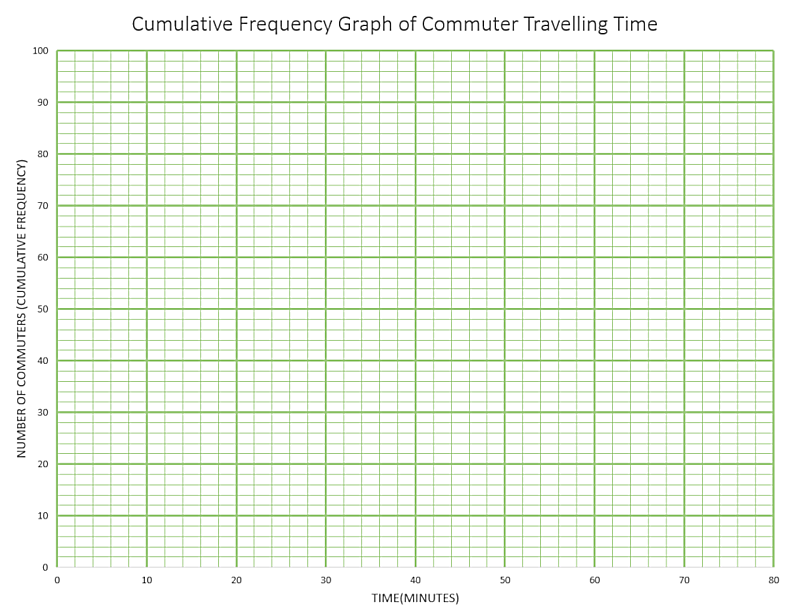
(c) Use your graph to find an estimate for the percentage of these commuters who take more than 45 minutes to get home from work.
2. | GCSE Higher [595] |
Kevin recorded the heights, in centimetres, of some cows.
| Minimum height | 104cm |
| Lower quartile | 121cm |
| Interquartile range | 23cm |
| Median | 128cm |
| Range | 67cm |
Draw a box plot to show this information.
3. | IGCSE Extended [112] |
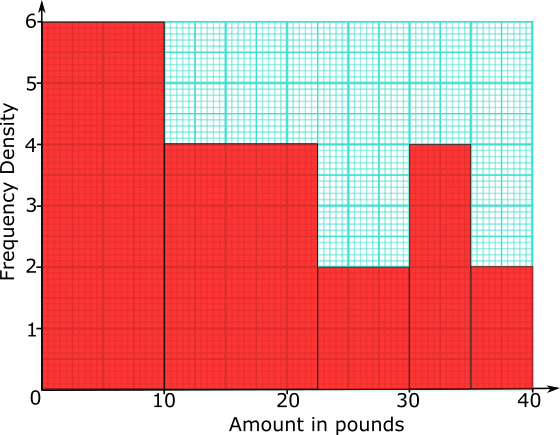
155 people were asked how much money they would pay for particular three-course meal in a special restaurant.
The histogram shows the results of the survey.
(a) Complete the frequency table for information shown in the histogram.
| Amount (£\(x\)) | \(0\lt x \le 10\) | ||||
|---|---|---|---|---|---|
| Frequency | 20 |
(b) Use your frequency table to calculate an estimate of the mean amount these people would pay for the meal.
4. | GCSE Higher [701] |
The distance walked by each of 68 hikers was recorded. The results are shown in the cumulative frequency curve.
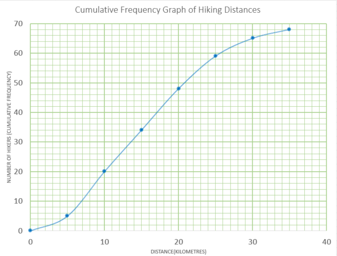
(a) Estimate the median.
(b) Estimate the interquartile range.
(c) Use the curve to complete the frequency table.
| Distance(\(d\) km) | 0 < d ≤ 5 | 5 < d ≤10 | 10 < d ≤ 15 | 15 < d ≤ 20 | 20 < d ≤ 25 | 25 < d ≤ 30 | 30 < d ≤ 35 |
|---|---|---|---|---|---|---|---|
| Frequency | 5 | 15 |
(d) Write down the modal class.
(e) Calculate an estimate for the mean.
5. | GCSE Higher [135] |
The scatter graph gives information about the marks earned in a Statistic exam and a Mathematics exam by each of 13 students.
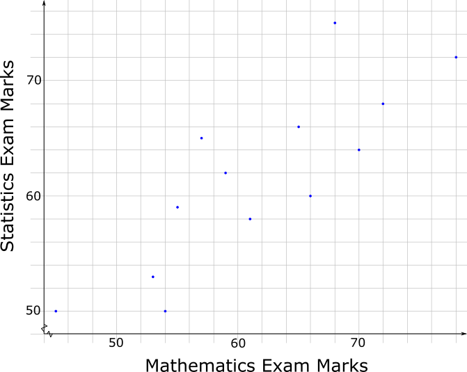
The box plot for the Mathematics exam for the 13 students is drawn on the grid below.
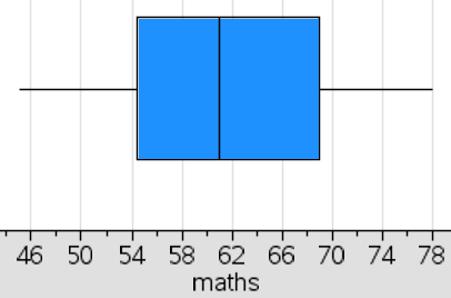
(a) Draw the box plot for the Statistics exam.
(b) Compare the distributions of marks scored in the two exams.
6. | GCSE Higher [404] |
Here is some information about the length of time children spent in a swimming pool at a holiday resort during a heat wave.
Draw a box plot to show this information.
7. | GCSE Higher [153] |
The table shows the marks earned by 200 students taking a Maths exam.
| Mark (n) | \(0\lt n \le 10\) | \(10\lt n \le 20\) | \(20\lt n \le 30\) | \(30\lt n \le 40\) | \(40\lt n \le 50\) | \(50\lt n \le 60\) | \(60\lt n \le 70\) | \(70\lt n \le 80\) |
| Frequency | 3 | 7 | 33 | 42 | 54 | 35 | 20 | 6 |
(a) Use the data in the table above to complete the following cumulative frequency table
| Mark (n) | \(n \le 10\) | \(n \le 20\) | \(n \le 30\) | \(n \le 40\) | \(n \le 50\) | \(n \le 60\) | \(n \le 70\) | \(n \le 80\) |
| Cumulative Frequency | 200 |
(b) Draw the cumulative frequency curve on graph paper.
The top 5% of students will receive an A grade. The next 15% of students will receive a B grade and the next 30% will receive a C grade.
(c) Use your graph to estimate the lowest mark that B grade will be awarded for.
8. | GCSE Higher [244] |
The table shows the amount of time, in months, taken to sell houses on the Happyland housing estate.
| Time (m months) | Frequency |
| 0 < m ≤ 2 | 10 |
| 2 < m ≤ 5 | 21 |
| 5 < m ≤ 10 | 25 |
| 10 < m ≤ 15 | 20 |
| 15 < m ≤ 20 | 25 |
(a) Draw a histogram for the information in the table.
(b) Find an estimate for the median.
9. | GCSE Higher [305] |
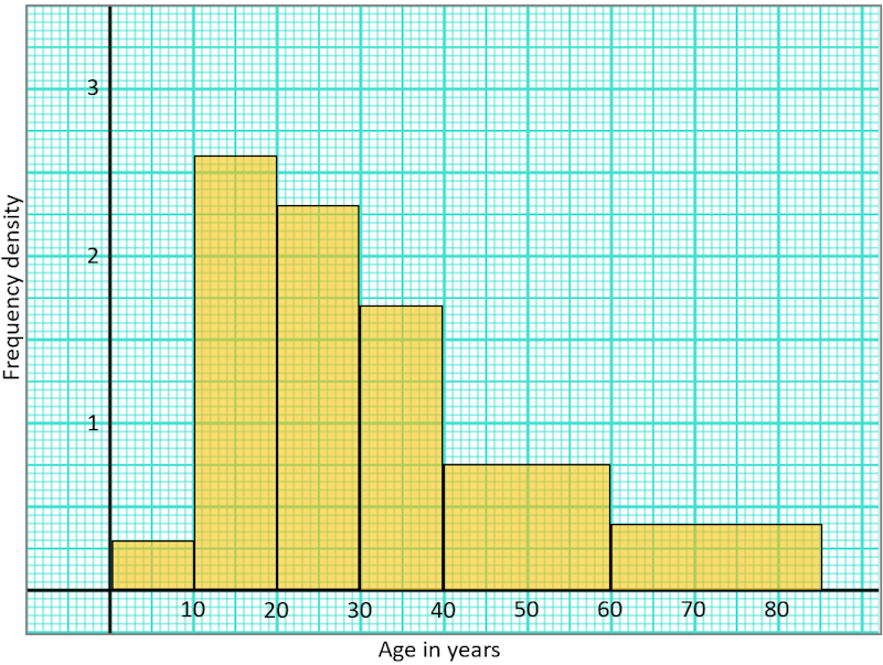
This histogram shows information about the ages of 317 people attending a charity concert. The cost of tickets for children under 15 years of age are half price. If a full price ticket was £18, estimate the total income of all 317 ticket sales.
10. | IB Studies [92] |
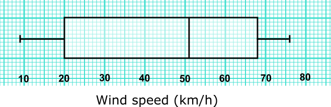
The distribution of daily average wind speed on an island over a period of 120 days is displayed on this box-and-whisker diagram.
(a) Write down the median wind speed.
(b) Write down the minimum wind speed.
(c) Find the interquartile range.
(d) Write down the number of days the wind speed was between 20 kmh-1 and 51 kmh-1.
(e) Write down the number of days the wind speed was between 9 kmh-1 and 68 kmh-1.
11. | IB Studies [108] |
The following grouped frequency table shows the length of time, \(t\), in minutes, visitors watched an octopus swimming around a tank at an aquarium.
| Time (\(t\)) | Visitors |
|---|---|
| \(0\lt t \le 5\) | 23 |
| \(5\lt t \le 10\) | 13 |
| \(10\lt t \le 15\) | 9 |
| \(15\lt t \le 20\) | 6 |
| \(20\lt t \le 25\) | 2 |
| \(25\lt t \le 30\) | 1 |
(a) Write down the total number of visitors who were included in the survey.
(b) Write down the mid-interval value for the \(20\lt t \le 25\) group.
(c) Find an estimate of the mean time visitors took watching the octopus.
The information above has been rewritten as a cumulative frequency table.
| Time (\(t\)) | \(t \le 5\) | \(t \le 10\) | \(t \le 15\) | \(t \le 20\) | \(t \le 25\) | \(t \le 30\) |
|---|---|---|---|---|---|---|
| Cumulative frequency | 23 | 36 | \(a\) | 51 | 53 | \(b\) |
(d) Write down the values of \(a\) and \(b\).
This information is shown in the following cumulative frequency graph.
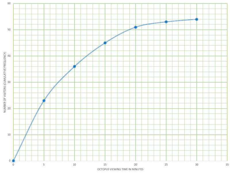
(e) Use the graph to estimate the maximum time taken watching the octopus for the first 32 visitors (arranged in order of increasing viewing time).
(f) Use the graph to estimate the number of visitors who spent less than 13 minutes watching the octopus.
(g) Use the graph to estimate the number of visitors who take more than 17 minutes watching the octopus.
12. | IB Applications and Interpretation [419] |
Derek has put together a fantasy football squad and has recorded the heights of all the players in the squad rounded to the nearest centimetre. The data is illustrated in the following box and whisker diagram.
(a) Write down the median height of the players.
(b) Write down the upper quartile height.
(c) Find the interquartile range of the heights.
The height of these players are normally distributed.
(d) Find the height of the tallest possible player that is not an outlier. Give your answer to the nearest centimetre.
13. | GCSE Higher [185] |
The charts below show the results of pupils in a Year Group answering twenty mental arithmetic questions.
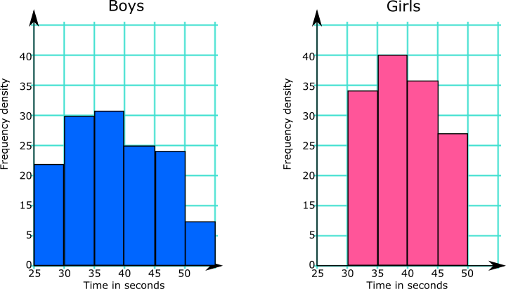
What information from the diagrams can be used to support or counter each of these statements?
(a) Girls are better at mental arithmetic than boys.
(b) The range of the boys' times is greater than the range of the girls' times.
The Head of the school would like to use this data to make statements about all of the pupils in the school.
(c) Comment on whether any conclusions can be drawn for the whole school population from the results of this Year Group.
14. | GCSE Higher [496] |
Poppy Pringle recorded the heights in centimetres of the sunflowers growing in her brother's and sister's gardens.
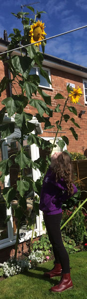
Here are the heights of the 19 sunflowers in her brother's garden:
$$94, 103, 110, 111, 123, 143, 150, 150, 151, 156, 157, 160, 170, 182, 201, 220, 250, 255, 261$$(a) Complete the table below to show information about this data.
| Median | |
| Lower quartile | |
| Upper quartile | |
| Shortest | |
| Tallest |
Here is some information about the sunflowers in Poppy's sister's garden:
| Median | 160 |
| Lower quartile | 143 |
| Upper quartile | 172 |
| Shortest | 110 |
| Tallest | 199 |
Poppy says that the sunflowers in her brother's garden are shorter that those in her sister's garden.
(b) Is Poppy correct?
You must give a reason for your answer.
Poppy says that the sunflowers in her brother's garden vary more in height than those in her sister's garden.
(c) Is Poppy correct?
You must give a reason for your answer.
15. | GCSE Higher [548] |
The histogram gives information about the distribution of the heights of some shrubs grown by a garden supplier.
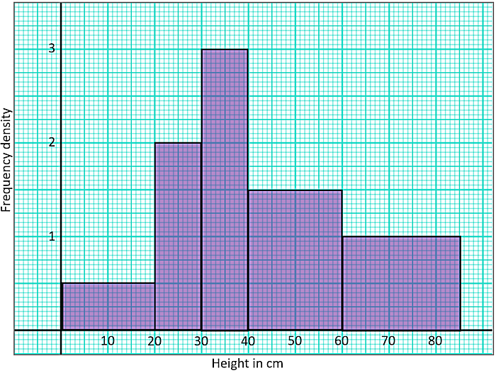
The shrubs are on sale at the following prices:
A pie chart is drawn using the information above to show the number of shrubs in each price category. Calculate, to the nearest degree, the angle in the sector representing shrubs sold for £12.
16. | IB Standard [29] |
The following table shows the number of days families spend in a particular seaside hotel in August last year.
| Days | Frequency | Cumulative frequency |
|---|---|---|
| 2 | 3 | 3 |
| 5 | 11 | 14 |
| 7 | 15 | 29 |
| 10 | \(x\) | 39 |
| 14 | 5 | 44 |
(a) Find the value of \(x\).
(b) Find the mean.
(c) Find the variance.
17. | IB Analysis and Approaches [625] |
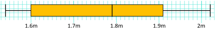
Data is collected about size in square metres of apartments in a city and the monthly cost of renting them. The size of the apartments is shown in this box and whisker diagram.
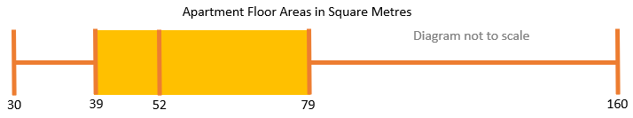
(a) Find the largest apartment area that would not be considered an outlier.
The areas in square metres and costs in pounds, denoted by a and c respectively, are plotted as a scatter graph.
The regression line of c on a is \(c = 5a + 130\). The regression line of a on c is \(a=\dfrac{c}{8}+10\).
(b) One of the apartments in the data set costs £680 per month to rent. Estimate the area of that apartment.
(c) Find the mean monthly rental cost of all the apartments in the data set.
18. | IB Analysis and Approaches [413] |
A TV company surveyed 88 of its employees to find out how much time they spend travelling to work on a given day. The results of the survey are shown in the following cumulative frequency diagram.
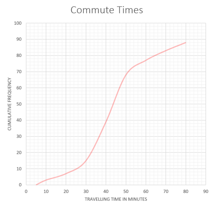
(a) Find the median number of minutes spent travelling to work.
(b) Find the interquartile range.
(c) Find the number of employees whose travelling time is within 20 minutes of the median.
(d) Only 10% of the employees spent less than k minutes travelling to work. Find the value of k.
The results of the survey can also be displayed on the following box-and-whisker diagram.
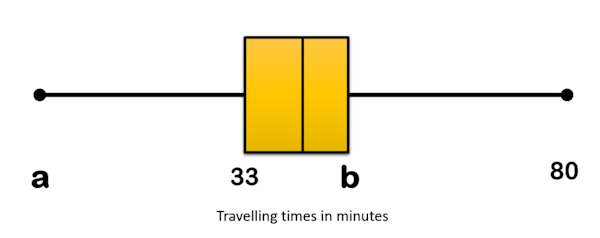
(e) Write down the value of a.
(f) Find the value of b.
(g) Travelling times of less than p minutes are considered outliers. Find the value of p .
19. | IB Studies [206] |
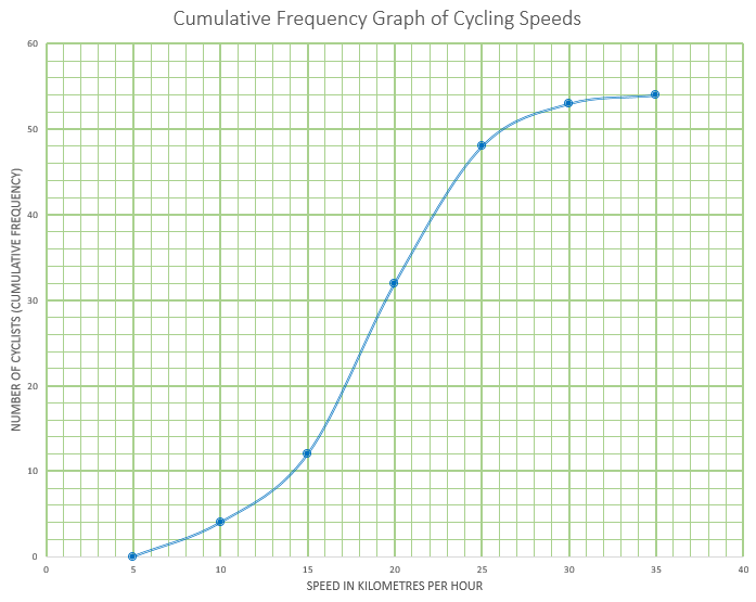
This cumulative frequency graph shows the speeds in kmh-1 of cyclists passing a certain point on a race track.
(a) Estimate the minimum possible speed of one of these cyclists.
(b) Find the median speed of the cyclists.
(c) Write down the 65th percentile.
(d) Calculate the interquartile range.
(e) Find the number of these cyclists that were travelling faster than 22 kmh-1
The table shows the speeds of these cyclists.
| Speed of Cyclists (s) | Number of Cyclists |
|---|---|
| \(0 \lt s \le 5\) | 0 |
| \(5 \lt s \le 10\) | \(a\) |
| \(10 \lt s \le 15\) | 8 |
| \(15 \lt s \le 20\) | 20 |
| \(20 \lt s \le 25\) | 16 |
| \(25 \lt s \le 30\) | 5 |
| \(30 \lt s \le 35\) | \(b\) |
(f) Find the value of \(a\) and of \(b\)
(g) Write down the modal class.
(h) Write down the mid-interval value for the modal class.
(i) Use your graphic display calculator to calculate an estimate of the mean speed of these cyclists.
(j) Use your graphic display calculator to calculate an estimate of the standard deviation of the speeds of these cyclists.
20. | IB Analysis and Approaches [581] |
Gringe Hull Secondary School has students from Year 7 to Year 13. A group of 138 students in Year 9 were randomly selected and surveyed to find out how long it takes them to travel to school each morning. Their results are represented by the following cumulative frequency graph.
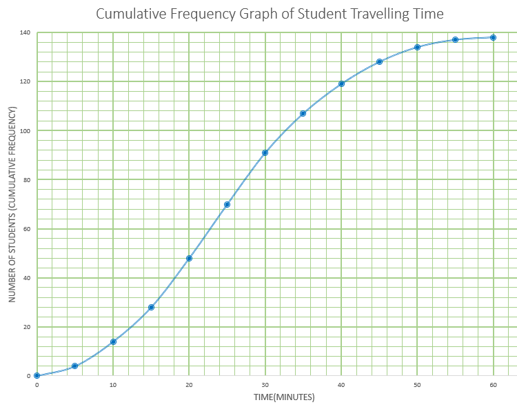
(a) Find the median number of minutes per day these Year 9 students spend travelling to school.
(b) Given that 20% of these Year 9 students spend more than \(k\) minutes per day travelling to school, find value of \(k\).
The same information is represented by the following table.
| Travelling time (m) in minutes | Frequency |
|---|---|
| 0 < m ≤ 5 | 4 |
| 5 < m ≤ 10 | 10 |
| 10 < m ≤ 15 | 14 |
| 15 < m ≤ 20 | \(p\) |
| 20 < m ≤ 25 | 22 |
| 25 < m ≤ 30 | 21 |
| 30 < m ≤ 35 | 16 |
| 35 < m ≤ 40 | \(q\) |
| 40 < m ≤ 45 | 9 |
| 45 < m ≤ 50 | 6 |
| 50 < m ≤ 55 | 3 |
| 55 < m ≤ 60 | 1 |
(c) Find the value of \(p\) and the value of \(q\).
There are 450 students in Year 9 at this school.
(d) Estimate the number of Year 9 students that spend less than 15 minutes travelling to school each day.
21. | IB Analysis and Approaches [555] |
A number of organically-grown carrots were measured (in centimetres) and the results recorded. The following box and whisker diagram shows a summary of the results where L and U are the lower and upper quartiles respectively. The diagram is not drawn to scale.
The interquartile range is 8cm and there are no outliers in the results.
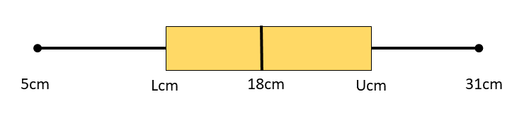
Find the maximum possible value of L.
Hence, find the maximum possible value of U.
If you would like space on the right of the question to write out the solution try this Thinning Feature. It will collapse the text into the left half of your screen but large diagrams will remain unchanged.
The exam-style questions appearing on this site are based on those set in previous examinations (or sample assessment papers for future examinations) by the major examination boards. The wording, diagrams and figures used in these questions have been changed from the originals so that students can have fresh, relevant problem solving practice even if they have previously worked through the related exam paper.
The solutions to the questions on this website are only available to those who have a Transum Subscription.
Exam-Style Questions Main Page
To search the entire Transum website use the search box in the grey area below.
Do you have any comments about these exam-style questions? It is always useful to receive feedback and helps make this free resource even more useful for those learning Mathematics anywhere in the world. Click here to enter your comments.