| Category | Number | Percent | Angle |
|---|---|---|---|
| Yesteryear | 183 | 25.4% | 91.4° |
| Future Zone | 204 | 28.3% | 102° |
| Adventureland | 182 | 25.3% | 91.1° |
| Haunted | 151 | 21% | 75.6° |
| Total: | 720 | 100% | 360° |
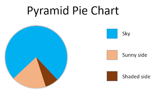
The labels on the pie chart sectors can be dragged to new positions to better annotate the chart. The calculated values in the table have been rounded to three significant figures where necessary.
This intended to be very easy and quick to use. For example a teacher could quickly obtain information from the class from a show of hands. They could be asked if they prefer hot or cold drinks and immediately the results could be typed into the form above to produce a pie chart.
Please note that only number should be entered into the 'Value' box. Do not include units or percentage signs. If you wish values to appear on the pie chart they could be typed in brackets after the category name [E.g. Hot (75%) ].
Here are some examples that a teacher could show to a class and discuss any improvements that could be made:
For more graphs and charts try the Show of Hands facility or visit the main Data Handling page.
Do you have any comments? It is always useful to receive feedback and helps make this free resource even more useful for those learning Mathematics anywhere in the world. Click here to enter your comments.


Simon Kuestenmacher, Twitter
Saturday, April 14, 2018
Unknown Source,
Sunday, July 7, 2019
" "
"
Eric Hittinger, Twitter
Thursday, March 20, 2025