This activity will collect data about your opinion regarding the clarity of some statistical graphs. When you have finished you will have access to all the data collected by this activity and invited to do some statistical analysis. Your work could be part of a school project, coursework or school internal assessment.
What does better mean? In this case it means which graph is clearer in terms of communicating statistics to you. This is a personal choice and in some cases it will be difficult to make but do your best.
What does better mean? In this case it means which graph is clearer in terms of communicating statistics to you. This is a personal choice and in some cases it will be difficult to make but do your best.
What does better mean? In this case it means which graph is clearer in terms of communicating statistics to you. This is a personal choice and in some cases it will be difficult to make but do your best.
What does better mean? In this case it means which graph is clearer in terms of communicating statistics to you. This is a personal choice and in some cases it will be difficult to make but do your best.
What does better mean? In this case it means which graph is clearer in terms of communicating statistics to you. This is a personal choice and in some cases it will be difficult to make but do your best.
What does better mean? In this case it means which graph is clearer in terms of communicating statistics to you. This is a personal choice and in some cases it will be difficult to make but do your best.
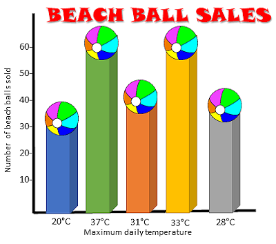
This activity uses Comparative Judgement based on the fact that people are better at making comparative, paired judgements, than isolated evaluations. You are presented with two randomly chosen statistical graphs or charts side-by-side and asked to use your judgement to select which of the two is most efficient at communicating the data accurately. Through repeated comparisons by many different visitors to this page, a reliable rank order is created by combining the judgements of all the visitors.
Note for Teacher: The purpose of this activity is to think about the features of a graph or chart which make it either useful or misleading. Discussion is encouraged. This resource could be a whole class activity, projected onto the whiteboard or it could work well if learners, in pairs, work through the comparisons on a shared computer.
Here is the URL to share:
Do you have any comments? It is always useful to receive feedback and helps make this free resource even more useful for those learning Mathematics anywhere in the world.
Click here to enter your comments.


